Tuesday, 30 November 2010

Toile..

                    The top..
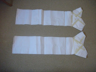
Firstly we drew out the patterns for back and front bodice, linning and the tunnels. Added seam allowance and cut out.


Next we placed both of our fabric on top of eachother measured that the width was 60cm and length being 1m. cut out both pieces of fabric.


Then we sewed up three side of the fabric and bagged out but leaving the bottom open.

Then placed our bodice pattern pieces onto the fabric. however unlike last time we subtraction cut we ensured that the pieces were high up the top of the fabric as we were making a top this time unlike the dress we previously made. we drew around the pieces and made our lines for our negative space. Cut out then added tunnels (only one pair.) we sewed the side seams together, the shoulders and the tunnels.

And ended up with our top. The back of the top was very high up so when it comes to our final garment we will place the tunnels on the back. Other than that we were very pleased with it and feel confident about making our final garment.


The skirt
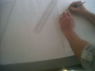
Firstly we drew around the skirt block but added our own length to it measuring the skirt from waist to bottom 110cm long. added seam allowance of 1cm and cut out.

Next we cut down the right side of the dart to the hip line and then cut along the hip line. tapped it back down to another piece of pattern paper..
                                              

Then we decided how big we wanted our dart to be and stuck down again.

Then we joint up the dart and added seam allowance.


Then cut out are pattern pieces in fabric sewed together the darts and side seams and we ended up with our skirt..

We were pleased with the structure of our skirt and once again feel confident about making the final garment as there were no complications and we felt it was easy to put together. All we need to do now was add a waist band.

Final Design..

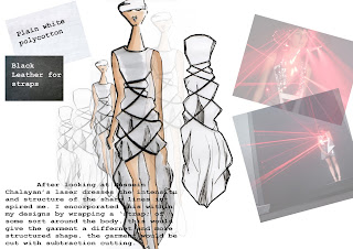
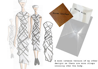
After Discussing our designs with eachother in the group we all agreed on a final garment. a transparent skirt structured to poke out at the top and fall down straight. And a subtraction cut top with leather straps placed around the body to give it some structure.
I am very pleased with our final outcome as it reflects all of our research and designs well.

Design Sheets..


Concept boards...


Wednesday, 10 November 2010

CONCEPT.................

.........After gathering some inital research I have decied on my final concept...


There are many different forms of light natural such as stars, the moon and the sun or manmade light such as light bulbs, lasers and torches. No matter what their purpose is they all do the same thing, give us light.

Light can make the simplest of things look more exciting for example when a historical building is lit up it becomes more appealing and modern.

Light can be used for many different things such as light bulbs so we can see when it is dark, police cars so we know when there is an emergency, traffic lights are used as a symbol to control cars everyday, fire is used to cook food or heat a room up, christmas lights come around once a year and are used for a celebration and fireworks are also a form of celebration. We see forms of light everyday and dont think much of them but where would we be without light?

I want to look into how clever light can really be. How it can draw in your attention without you even noticing its doing it. How it can create illusions and make you think your seeing something your actually not.

My aim is to explore the uses of light and all of its possibilities I plan to do this by creating a new innovation deesign which will be backed up from my initial reserach.

Things I found...

Slideshow image
Slideshow image
Slideshow image
Slideshow image
Slideshow image


United Visual Artists created a light installation for Y-3’s Fall 2010 show as part of New York Fashion Week. A white monolith of light created a void out of which the models emerged. Using white lasers, UVA built an illusion of architectural forms that defined the catwalk area, shifting in shape and composition over the course of the show.

No author. (2010). y-3 fall 2010. Available: http://www.uva.co.uk/archives/125. Last accessed 10th nov 2010

The lasers distort the catwalk and create an illusion that the catwalk is changing shape. Once again I think it looks like something from space. the black background with white lasers looks amazing and really helps the lasers to stand out. Once again the sharp lines and angles of the lasers draw in the audiences attention in and points at where you should be looking. It it a great way to show something off without being so obvious.


Lanterns in the Barbican. The canteen had walls filled with these glass containers with bulbs that light up.

London Bridge
Lit up at night